

Transubstantiation
Transubstantiation
Glitch, data bending, and the change of the substance of sound into the substance of image

Over the past three weeks, I’ve been preparing a talk about data bending. Data bending is a glitch art technique: “…the process of manipulating a media file of a certain format, using software designed to edit files of another format.” [Wikipedia]
I told several friends that I was preparing this talk. Instead of saying that it was about data bending—because I assumed that they didn’t know what that is—I said that it was about glitch art. It turns out that they didn’t know what glitch art, or a glitch, is. Sometimes I forget that these kinds of things are not so mainstream.
Probably most of you are into new media art, art, or technology, and know what a glitch is, but let’s talk about glitches.
A glitch is an error, but not any kind of error. In terms of new media art, we use the term to describe a temporary error, usually of unknown origin. If you see a glitch in an image, for example, it could be for a lot of different reasons: the file is corrupted, there’s a missing codec, a hardware problem… If you’re a computer engineer, maybe you’ll be able to understand why a glitch is happening, but for most of us is something random and mysterious.

In the 40s and 50s, the word “glitch” was already in use to talk about low-frequency interferences and mistakes in live radio broadcasts. It was not a common word, it was used mainly by radio and TV professionals. Also, it wasn’t an English word. It comes from the German glitschen, meaning “lapse” or “slip”. In the 40s, a lot of the radio people in the USA were Yiddish, so the most widespread theory is that the term was imported via Yiddish.
If you’re interested in language, here’s a good explanation about where “glitch” comes from: The Hidden History of "Glitch"
Anyway, in the 40s and 50s glitch art was not a thing, or it didn’t have that name. I discovered glitch art in the late 90s, when I was studying animation and new media, but glitch art started way before that. In 1978, Raul Zaritsky, Jamie Fenton, and Dick Ainsworth created Digital TV Dinner by manipulating a video game console called Bally Astrocade.
Before the digital era, a lot of artists were already working with electronic errors. The following video about Nam June Paik talks about one of the most popular examples. You can also check the work by Steina and Woody Vasulka, who later used digital media. And let’s not forget that art was already playing with errors in “traditional” media. For instance, in the 50s, Len Lye made Free Radicals ruining film using dental tools and arrowheads.
In any case, I’m not here to write an essay about glitch art. This was just a short introduction to explain what glitch is about. Also, I’m not a glitch expert—Rosa Menkman is a great one. I’m mostly interested in one particular glitch technique: data bending.
What you see is what you hear
I’m obsessed with the relationship between image and sound, so I use data bending for transforming sound into image, and vice versa, but you can do a lot of other things, such as editing images using a text editor.
Data bending is a digital process, but sound visualisation is a thing since a long, long time ago… Let’s start with a couple of examples from the 19th century.
Margaret Watts Hughes
In 1885, Margaret Watts Hughes, a singer that wanted to visualise her voice, invented the eidophone.

The eidophne was an elastic membrane stretched over the opening of a trumpet-shaped tube. Watts Hughes placed sand, lycopodium powder, or some liquid, on the membrane and she sang. She later tried other substances and even tints to get coloured images. She discovered that singing in different manners produced different “drawings”.

You can read a complete explanation about the device and some of her theories in Visible Sound: Voice-Figures, written by herself. The best article that I’ve read about her work is Picturing a Voice: Margaret Watts Hughes, which includes some wonderful full-colour images.
Mary Hallock-Greenewalt
Mary Hallock-Greenewalt was a pianist born in Beirut in 1871. She was mixed-race, her father was an American consul and her mother an upper-class Arab teenager—yes, he married her when she was still a minor. When her mother died, Hallock-Greenewalt was still very young and her father sent her to the USA.
She wanted to be a pianist, but there were so many pianists that it was difficult to stand out. Her marketing plan was to create an audiovisual show that would go beyond standard classical music. She invented several devices—someday I’ll write her complete story—but now I’m just gonna mention that she built a colour organ and created a conceptual system to link notes to colours.

If you want to know more, there’s a complete book written by her entitled Nourathar: The Fine Art Of Light Color Playing. Nourathar—a combination of the Arabic terms nour (“light”) and athar (“essence”)—was the name that she gave to the art of combining sound and light. The name of her colour organ was Sarabet—in honour of her mother: Sara Tabet.
What Watts Hughes and Hallock-Greenewalt did wasn’t data bending, because it wasn’t a direct translation between data, but we have an analog precedent a bit later with optical sound.
Sound recordings on film

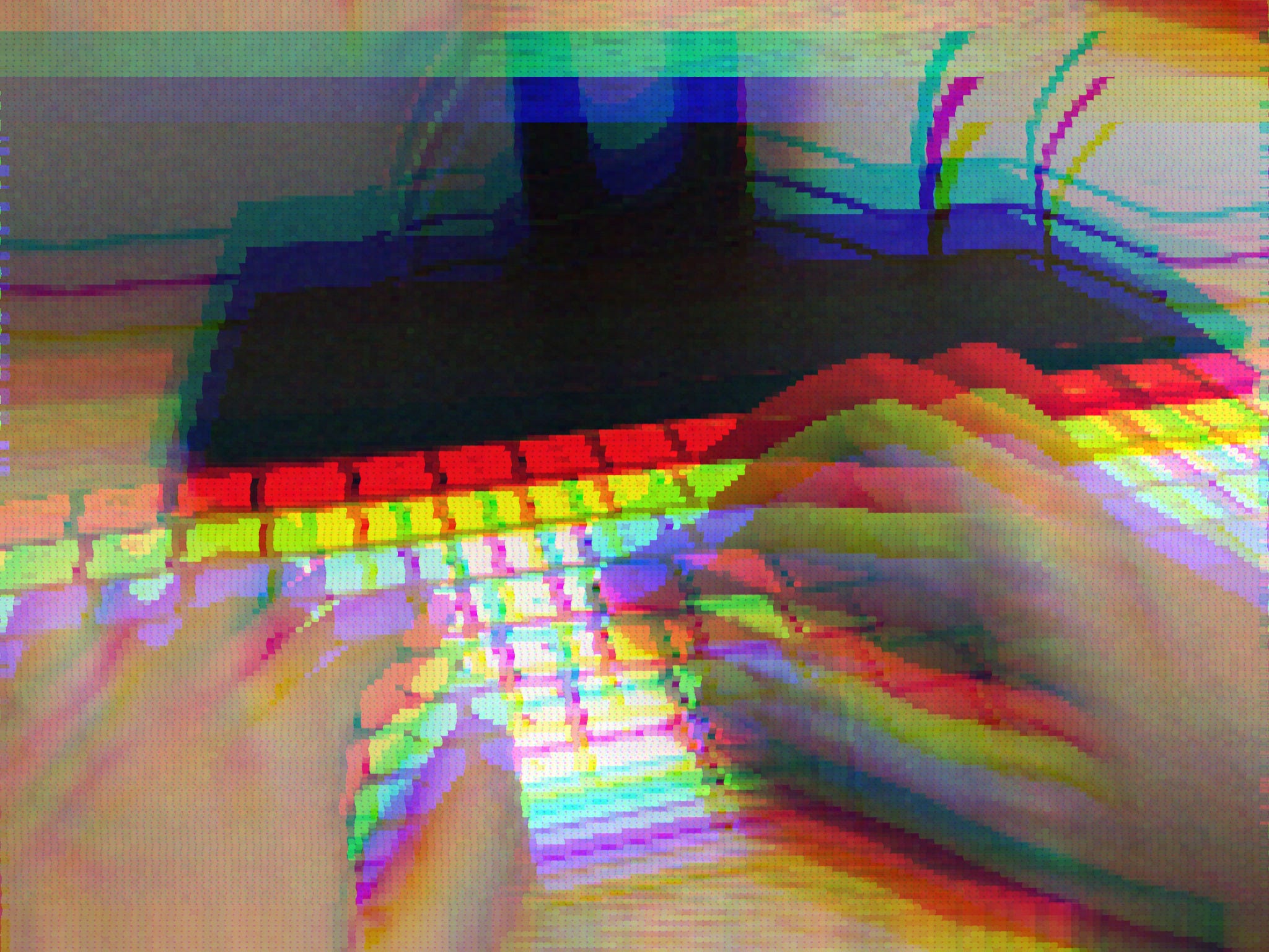
What you see in this image is a film from the 60s—it’s a fragment from a copy of Arnulf Rainer by Peter Kubelka that I have at home. You can see the soundtrack because from the 20s until the 70s most films had the soundtrack printed on the right side. This is called “optical sound”. You can find a good explanation of how it works in this educational film.
Some artists, filmmakers, and engineers said to themselves: “Hey, if soundtracks are graphic shapes maybe we could paint sound”. And they did it. There’re many examples of this, from the 20s until today, so I’m just gonna mention one of them and some other week I’ll write a complete article about optical sound in film and synthesisers.
This film is by Norman McLaren. He has other optical sound films, but this is the best one. What you see is an abstract animation, and what you hear are the same shapes, that are also drawn in the soundtrack. This film is also interesting because there’s another one in which McLaren explains the technique that he used for all his optical sound films.
From my point of view, this is data bending, even if it’s not digital, because what you hear is an image, a drawing. McLaren was not mapping aspects of the sound, like Hallock-Greenewalt, or using cymatics—the study of wave phenomena—, like Watts Hughes. He wasn’t the first one that used this technique, but I choose his film because even if it’s from the 70s the kind of images and sounds that he uses are quite similar to some digital contemporary artworks by electronic musicians and new media artists.
Data bending: Turning sound into images
This is an easy tutorial to turn sound into images. I wrote this some years ago for my blog, so maybe some of you have already read it.
How to turn sound into images 1: Audacity

First, you need an audio software that saves RAW files. You can use a lot of different software, for this tutorial I’ll use Audacity, which is cross-platform and open-source, so you can download it for free. Open Audacity and then open or create an audio file: music, noise, a pure tone, whatever… It doesn’t matter.
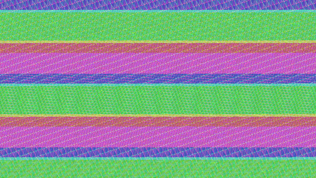
I’ve generated a 440Hz sinewave (Generate > Tone > Waveform: Sine). You have to export your sound as RAW.

File > Export audio > Format: Other uncompressed files. Options… Header: RAW (header-less). In Encoding, I choose U-Law or A-Law because I think that the images generated using those encodings are more aesthetically appealing, but you can try other options.
Now you have a .raw file. For the next part, I use Photoshop, any version. I have tried other image editors, some of them work, but not all. Some image editors don’t recognise RAW files saved using Audacity. If you have GIMP, which is free, it’ll work, but to open a .raw file you’ll need to change the .raw extension to .data.
How to turn sound into images 2: Photoshop
Open your RAW file in Photoshop. You’ll see this window.

Enter the dimensions, the only limitation is the size of the RAW file. If you enter very large numbers, you’ll see this message: “Specified image is larger than file.” If that’s the case, reduce Width and Height.
Channels Count is the colour information: 1 for black & white images, 3 for colour images. You can check Interleaved or not. Usually, I prefer to uncheck it because I like it better (just for aesthetic reasons). Click OK and that’s it!

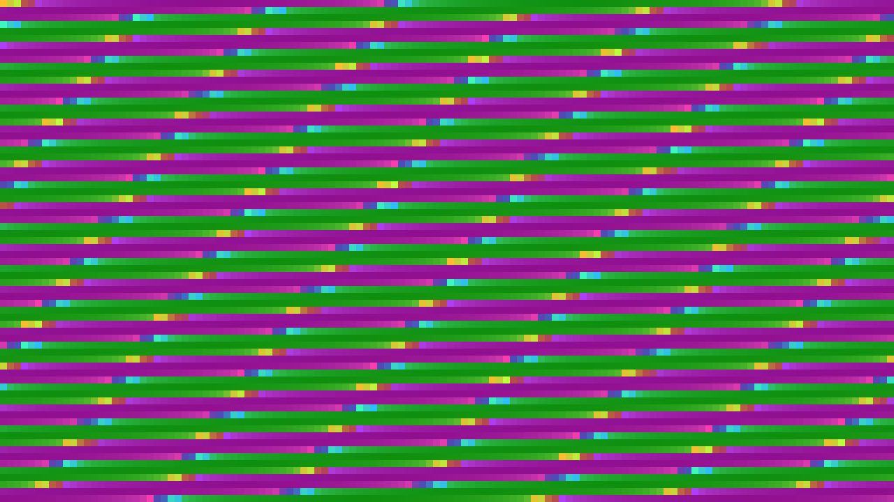
This is my 440Hz sinewave. I entered Width: 1000, Height: 1000, Channels Count: 3, and unchecked Interleaved. If you use other dimensions, even with exactly the same RAW file, you’ll get another pattern.
If you use music instead of pure tones, the result will be completely different. Sometimes just noise, sometimes much more interesting. As you can’t predict the outcome, you’ll get many uninteresting images. But, if you keep trying, you’ll get also some wonderful surprises from time to time!
If you want to support my work or this newsletter or pay me for English classes because my writing is awful… I’ll be very grateful and I’ll write more and better.
I’m not an English native, so probably this newsletter has some spelling mistakes or some weird sentences. I’ve learned more English by watching films than by going to English classes. ¯\_(ツ)_/¯
Another way of support that it’s completely free is just sharing this.
If you have anything to say about any of this or if you’re curious about my stuff, I’m here and:
[at] twitter
[at] vimeo
[at] bandcamp
Wherever, whatever, have a nice day :)